In Porto Cervo, Sardinia, a very special commercial space has been created. The La Pachamama herbalist shop, designed and built entirely by S.C. Artroom, is a place conceived as a total design object, straddling art and craftsmanship, with an almost mystical inspiration
Text by: Domenico Costantini
A feelgoodstore where we can buy things that make us feel good and where, of course, we feel good when we enter. Sergio Calatroni, the mastermind behind this project, has designed the 220 square metres available from top to bottom, as if the space was a three-dimensional object. Everything, in fact, from the spatial concept to the furnishings, from the lighting to the graphics, from the colours to the logo, is a game of references and quotations. When you arrive in front of it, the first impulse is to come in and see what it is all about. The explicitly vivid colours attract and absorb all the attention. In front of a space that exudes singularity, perhaps, says the brain accustomed to large chains and “generic” design, this is not a commercial space.

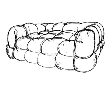
What are we looking at? The eye is seduced not only by the pungent colours but also by the sinuous shapes of the furniture-sculptures, which also serve as product displays. The archaic origin of the volumes, and their actual concreteness, means that the furniture acts as a support in the most natural way: for people, for objects, for everything. “They are bases but in the same way pedestal symbols, in which something else resides,” says Calatroni. “They recall the primordial Neolithic blocks of carved stone, and the hallmarks of the works of Brancusi and Noguchi“. An archetypal nature that brings to light the core of the design idea: art and the mystery of its origin. And that starts with its name, Pachamama, which in the Quechua language means Mother Earth, the great mother goddess, a deity of agriculture and fertility worshipped by the Incas and other peoples living on the Andean plateau, such as the Aymara and Quechua. A space, therefore, in which art unleashes the inapparent, that of which we still know nothing: neither where it springs from nor why. This is the sense of the apparent primordiality of the forms of this contemporary interior work in which “utility has not been misunderstood, but put in sync, at the disposal, of the imagination; that is, at the goings-on of images perceivable through the senses”.
A perfect mix of art, craftsmanship and function, expressed through a storm of colour that is absorbed by a monochrome yellow, the chromatic scaffolding of the entire space. “What gives another sharp edge to the place are the luminous star-shaped deviations of the neon lights on the ceiling that dynamize the order, and the distribution of a theory of a minimalist backdrop of shelves. Thus, it happens that the work, obstinately conceived in a constricted form, flows towards its origins. Towards another unknown”.
Miyuki Yajima, the artist who worked with Calatroni on the design of the space, tells us how they tried to offer functional responses, suited to the needs of the location, while safeguarding the creativity of the project. “A pharmacy or herbalist’s shop like Pachamama,” explains Yajima, “needs a lot of furniture to display its products. At the same time, it needs to exude a certain kind of cheerfulness for customers who have some kind of physical health problem. It needs to be spacious to make customers feel relaxed. A pharmacy needs to be friendly”. These are the observations that led the design of Pachamama’s spaces. The combination of colours, the fluid and transformable shapes, the large and long shelves, with doors and without doors, are the elements that combine to create a functional and welcoming result that elicits an emotional response from those who enter. Yajima then came up with the idea of putting the Pachamama logo on the window next to the entrance, to partly conceal the interior of the shop and stimulate the curiosity of passers-by. The lighting is also important. In fact, the lines of the shelves have been cleverly directed to become almost abstract graphic designs in a sensual play of light and shadow. Everything, from the furniture to the business card, has been created by Calatroni and Yajima, in a handcrafted dimension that has given extreme attention to detail. “It is very important for us,” adds Yajima, “to carry out the projects entirely with our own hands, so as to create a perfectly coherent image, studied down to the smallest detail. This time, too, we had a lot of fun”.