The kaleidoscopic paintings of the British born artist, now based in Copenhagen, “reinvent” themselves for an exclusive collaboration with the Scandinavian brand, adding a splash of colour to the fashion trends of this season
Text and interview by: Gilda Bruno

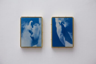
Jon Pilkington for Wood Wood PF21 Collection. Photography: Brett Lloyd.
Founded in Nørrebro, one of the most multicultural and trendiest districts of the Danish capital, back in 2002, Wood Wood is a contemporary fashion and lifestyle brand conceptualised by co-founders Karl-Oskar Olsen and Brian SS Jensen. Having shaped itself around the urban culture-inspired atmosphere of the ’90s, the brand encapsulates influences coming from worlds as diverse as sports, art, and music, and reinterprets them through streetwear while always keeping an eye on youth’s refreshing contribution to society.
Quoting the founders’ own words, Wood Wood’s vision is best described as the balanced combination of “expression and function:” two complementary principles useful to preserve the label’s stylistic authenticity against the monotony of fast fashion and guarantee the highest standards of wearability.
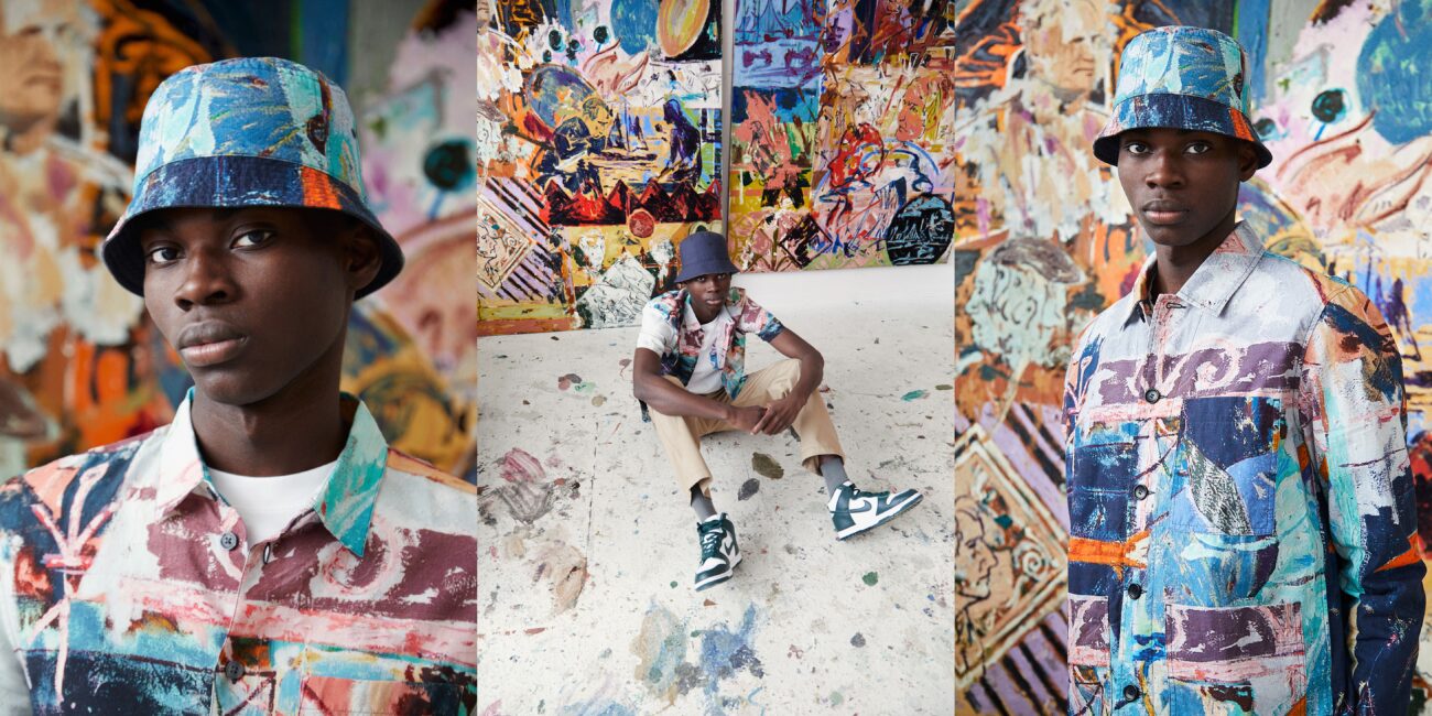
For the Pre-Fall 21, the brand has turned to Jon Pilkington’s visionary talent, granting him the opportunity to see his paintings take on the form of an all-over printed two-piece set, a light lyocell shirt, cotton jerseys, and a reversible bucket hat. Deeply inspired by and permeated with the playfulness and beauty of Napoli’s summer aesthetics, the collection is an ode to natural, truthful, and limitless expression. An idea that Pilkington has perfectly translated onto canvas in each one of his vivid multilayered paintings.
Below, the artist talks about the ins and outs of the Wood Wood collaboration, how colours define the shaping of his artworks, and darts — his guilty pleasure.
Jon Pilkington for Wood Wood PF21 Collection. Photography: Brett Lloyd.
Collectible DRY: For those who might not know you, could you tell us something about yourself?
Jon Pilkington: I am a British artist living and working in Copenhagen. After studying and living in London for a number of years, I moved to Copenhagen at the beginning of 2017. I love Liverpool FC, Yorkshire Tea, Big Coats, and Japan.
CD: Could you give us any insights into your collaboration with Wood Wood?
JP: I was asked to make the first PF21 at the start of 2020, just before the first lockdown here in Copenhagen. As a big fan and admirer of the brand and its history, I was really excited about this collaboration. It started with a very specific palette and some conversations around full prints and how this could be translated in the best possible way without compromising the painting. For me, the relationship between art and clothes is a pretty organic one. For someone who grew up in working-class Northern England, clothing is an integral part of identity dictated by many insular trends; be that an air max 95, a Stone Island Overshirt, or a nod to Japanese mountaineering in the form of Montbell shell jackets.
Jon Pilkington for Wood Wood PF21 Collection. Photography: Brett Lloyd.
Once you start to introduce artworks onto garments, they take on a new life. Something that is in many ways chaotic and challenging can become calmer upon reproduction. Its original context is removed and almost feels like it’s evenly disseminated; it becomes more accessible ready to be integrated into many different places and contexts. With the way the full print shirts are made and the fabric is cut, it allows for no two to be the exact same. I like the idea of something that, despite being reproduced from a single image, can produce so many alternatives to the original, [and that’s exactly what happens in this collection].
CD: What made you choose Wood Wood for your first fashion partnership?
JP: I have a huge admiration and respect for Wood Wood and its identity. Even before moving to Copenhagen, I was already aware of how influential the brand is and what it embodies. Having lived in Nørrebro — the Danish neighborhood where Wood Wood first started — for the past four years, it was easy for me to get a sense of the relevance and impact the label has not only on this area of the city but also on Copenhagen’s culture as well as on a whole generation of people. For me, it was no problem to hand over the artworks as I knew and believed that those would be in good hands. [I also knew that] the products and ideas that Wood Wood had were strong and would be carried through successfully whilst still preserving the artwork’s own integrity.
From the very early conversations we had, I knew that we were on the same page, wanting to create a range of products that elevated staple items in the collection. Exploring small details like the use of a reversible bucket hat, the simple hand-drawn Wood Wood logo, and the personalised swing tags with the more elaborate full-printed garments was something that I really enjoyed working on. Personally, I think that it was exactly these small details that took the collaboration to the next level. In fact, this allowed the original artwork its full potential in the form of the full print garments, while also ensuring that everyday staples — like the tees and bucket — would remain simple and classic, with small details giving the pieces a twist.
Jon Pilkington for Wood Wood PF21 Collection. Photography: Brett Lloyd.
Working with everyone at Wood Wood was very easy as we always had an open dialogue about what we could explore both materially and conceptually. [A key aspect of the collection lies in the] selection of high-quality materials that are European made and feature 100% organic and durable leaves, for a range of products that stand the test of time whilst also considering the environment we live in. The added detailing of no two full print pieces being identical was something I was very happy about especially because, due to the way the garments are made and cut, there is little to no fabric wastage. Plus, the production process allows for the painting to be reproduced many times over in many different configurations.
CD: How would you describe your art practice in one sentence?
JP: A lot of laboured decisions, painted quickly.
CD: Your paintings and ceramics appear characterised by an overlap of colourful layers and a juxtaposition of geometrical motifs and shapes, human figures, and still life elements. Specifically, the absence of clarity and the rejection of a straightforward interpretation seem to be two dominant features permeating your entire artistic production.
Where does this stylistic choice stem from? What artists – if any – have influenced the development of your body of work?
JP: This comes from the abundance of information we are forced or presented with I guess. I am constantly striving to remove things from their original context, whether it be by reducing motifs to their bare essentials or repeating motifs until I believe they are my own. I constantly draw inspiration from artists such as Jockum Nordstrom, Michael Krebber, Raoul De Keyser, Alfred Wallis, Harmen Steenwijck, Richard Aldrich, Clarice Cliff, Andre Derain, and Martin Parr.
Jon Pilkington for Wood Wood PF21 Collection. Photography: Brett Lloyd.
CD: What function does colour play in your artworks? Are colour shades assigned purposefully to each element of the painting, or are those the result of a more instinctive process?
JP: Essentially, I am a colourist. Although it took me a long while to process this, I’m now fully aware that the works function thanks to the sickly juxtaposition of colour pairings. I’m interested in colours that shouldn’t necessarily work together and how this influences the figurative or abstract elements of the painting. I think colour is a way of reading or interpreting in painting; a way in, so to say. Still, for me, it’s always about using palettes that become awkward or uncomfortable. It’s a bit of both, sometimes I start with a very specific limited palette (like I did in the Wood Wood collaboration), and other times colours and hues are born from the process of painting. The constant back and forth can always alter the direction of the palette.
CD: What’s your legacy? What would you like people to take from your work, and what can we expect from you in the future?
JP: I think it’s hard to say what my legacy is or will be, but I am extremely grateful for being able to do what I do for a living. That brings about unrivaled life quality in itself. I enjoy the whole process of making the work, right from the beginning so, if that’s something others can perceive, I am pleased. I hope there is accessibility and relatability in what I do that people can feel connected to. The paintings cover a lot of historical ground; not just within art history, but generally. So I’d like to think that, with the nods to selected eras and subcultures, my work weaves itself into many social situations. I play a lot of darts in the studio so, if I don’t make it as a professional darts player, you can expect some more paintings.
Jon Pilkington for Wood Wood PF21 Collection. Photography: Brett Lloyd.